Thursday, 28 April 2016

Pre-Submission Crit with Simon

I was feeling rather anxious ahead of my pre-submission crit this afternoon, as I felt I was rather behind. Infact after speaking to Simon, I feel pretty ahead of the game as I have pretty much designed all my design boards and it seems like all my projects are almost there. I keep forgetting three weeks in plenty enough time.

The crit was a chance for me to speak about my "writing language" as I feel it isn't in-depth as I am well aware that I use rather vague colloquail language on my blog. I have no problem with writing, however when it comes to writing about my own work, one struggles! I really wanted to know the difference between blog and design board language. Some points Simon and I raised which I need to take on board when it comes to writing about my own work/research:

  • Always ask WHY? who what where when and why and all that
  • Think about whether there are any Historical/Contextual referances that I could discuss, for example Arts & Craft movement
  • Justification - Always justify what I am doing
  • I like the colour pallete... why? is the colour calming, would the colours work in this are there any connnotations etc
  • Use summative language on my design boards 
  • It is okay to use first person 

Saturday, 23 April 2016

Feathr: Final Wallpaper

Feathr 

Here is my final wallpaper entry to Feathr suitably named, "Florals for Spring". The colours are bright and refreshing for a room. Overall, I am impressed with what I have accomplished within the three days. 


Designed Tile 


Feathr: Different Types of Repeat Pattern

Different Types of Repeat Pattern


Straight match: the left and right edges of the tile match in a straight horizontal line with the left and right edge of the next tile.

Half drop / offset match: the match is obtained by half dropping the repeat.

1/3 drop: the adjacent tile drops down 1/3 length of the design

1/4 drop: the adjacent tile drops down 1/4 length of the design

Mirror: the match is obtained by turning every second strip of wallpaper upside down.

Free match: the repeat has no match. The tiles can be hung next to each other without having to match any parts of the pattern


You can clearly see the lines of the yellow and purple flowers going vertically and horizontally across the wallpaper, which is quite distracting to the eye.  

Here, I have used a mirror tile effect, the match is obtained by turning every second strip of wallpaper upside down. I am not sure that the tiles work upside down, it does not work free falling. 

Here I have used the adjacent tile which drops down 1/4 length of the design, I think this works best, and created a wave/rippling effect of flowers across the wallpaper.

Friday, 22 April 2016

Feathr: Photoshop


After I scanned in my paintings, I got to work on photoshop cutting out the illustrations and boosting the colours. Overall, I am really impressed with what I have managed to produce in such a short time frame. I really like the delicate colour palette, very spring/summer.  I wanted to create a calming and relaxing wallpaper which is suitable for a bedroom.


Feathr: Watercolour


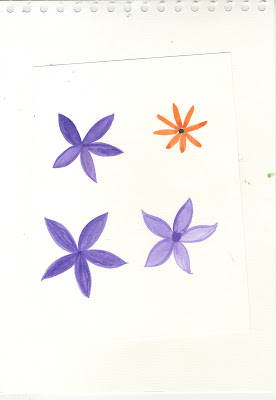
I spent the morning using my, Winsor & Newton Drawing Ink Set, attempting to paint  some spring/summer flowers. In the afternoon, I went into college and scanned in what I produced.

I began by painting simple leaves, once I felt I had mastered the leaf I began to paint some tricky flowers. I was pleasantly surprised with what I painted and I feel I have enough paintings to make a repeat pattern for a floral wallpaper. 

I want to create 


Overall, I am happy with how they turned out. Next step is to edit them on Photoshop. 


Thursday, 21 April 2016

The Arts & Crafts Movement

Before going ahead and creating a floral wallpaper, I felt I should first do some historical and contextual research into why we have floral/decorative wallpaper hung up in our homes, which is largely due to the Arts & Crafts movement of 1880. This will add some really concept and meaning behind my work.


The two most influential figures were the theorist and critic John Ruskin and the designer, writer and activist William Morris. Ruskin examined the relationship between art, society and labour. Morris put Ruskin's philosophies into practice, placing great value on work, the joy of craftsmanship and the natural beauty of materials.

By the 1880s Morris had become an internationally renowned and commercially successful designer and manufacturer. New guilds and societies began to take up his ideas, presenting for the first time a unified approach among architects, painters, sculptors and designers. In doing so, they brought Arts and Crafts ideals to a wider public.


I love the calming nature of William Morris's patterns and colour palettes (as seen above). Morris himself summarised the key qualities for a designer, which I found in William Morris: making the best of it, he said;

 you must fully understand nature and study it closely, know your history and then develop and use your imagination.

and 

Ornamental pattern work...must contain three qualities: beauty, imagination and order.

and 

Above all, avoid vagueness...definite form bounded by firm outline is a necessity for all ornament...do not be afraid of your design or try to muddle it up so that people can scarcely see it; it if it is arranged on good lines and its details are beautiful you need not fear it looking hard so long as it covers the ground wel and is not wrong in colour. 

The was a movement was born of ideals. Grown out of a concern for the effects of industrialisation: on design, on traditional skills and on the lives of ordinary people. So response, it established a new set of principles for living and working. It advocated the reform of art at every level and across a broad social spectrum, and it turned the home into a work of art. For that reason, for my wallpaper I want to draw inspiration from Morris's floral wallpaper patterns but bring it up-to-date for the new modern comsumer to hang in his or hers bedroom. So it is their personal, unique "work of art"/decorative piece of artwork. 

Feathr Research

Research

I want to create a wallpaper that is contemporary and refreshing for spring/summer, so I am already thinking florals. Perhaps watercolour flowers? 

https://uk.pinterest.com/vanessacain94/p-a-t-t-e-r-n/

I am no wallpaper fan myself but I do love a good pattern (on pillows rather than the walls) The patterns below I simply j'adore. They are a good source of inspo, regarding style and colour palettes that I need to consider. 


Love the colour palette. 

graphite pencil used

Lovely fresh colour palette on this

I love the colours and patterns created with leaves.

Not enjoying the colours, but an interesting illustrative style

OUGD603: Feathr Brief

Feathr


I have set myself three days to complete a wallpaper design for Feathr. I thought it would be a good chance for me to practice a more expressive illustrative and colourful style as a lot of my work can be quite minimal. Also it gives me a challenge, as I will be out of my comfort zone and under time pressure. I did enter Feathr last year but I was really unimpressed with what I produced! So I am hoping to redeem myself this time around.  

Brief 

Design specs & tips.

Create an artwork that can be used as a repeating design for a 50cm x 10m wallpaper roll. 

The roll width is 50 cm. This is the horizontal repeat of the artwork. The roll length is 10m, so your vertical repeat has no other limitations than looking good on a wall. N.B. For ease when hanging, we recommend keeping the vertical repeat to under 100cm. 

Repeats can be: straight matches, offset matches (half, quarter or third drop) or mirrors. N.B. For ease when hanging, we recommend free matches. 

Artwork sizes & specs:

For initial artwork please submit one tile of the repeat at www.feathr.com/submit 

Width: 1560px Length: one vertical repeat of your design 
Format: PNG or JPG 72 dpi If your design goes on sale, we’ll need a print ready tile: 
Width: 50cm Length: one vertical repeat of your design 
Format: TIFF Colour: CMYK 300dpi 

Submissions close 12pm 2 May 2016. Submit at www.feathr.com/submit.


Reflect: Final Entry


The Reflect brief for LCA End of Year Party, was a chance for me to do a quick live brief! I found out about the brief late, which only gave me the afternoon to complete a poster. I enjoy working under pressure and from my experience of working industry you do only have short timeframes to complete things. Being able to work under pressure and priotise work is something I pride myself on. 

I looked at posters produced in 1990s such as posters for Fantazia Raves. They are a great example of visual imagery and surrealism! As I only had an afternoon, I had to source my own imagery instead of creating my own. By using 90’s imagery it was relevant as the 90’s seems to be back in fashion.

The brief improved on my layout and type skills. I wanted to create a contemporary modern poster with an element of interest by using eye-catching surreal imagery. I wanted the type to be clear and easy to read as well as appealing to my target audience of designers and creative students, sometimes simple works best. I wanted all the information to be clear and easy read with the sponsors at the bottom.  

From my final entry to Leeds College of Art Student Union you can see I have kept to a clear and minimal design, this is because I am appealing to a creative young audience of designers. Despite only spending an afternoon on this brief I am happy with what I have produced, especially as poster design really is not my forte, I feel I have stepped out of my comfort zone with this brief.


Wednesday, 20 April 2016

Reflect: Design Decisions

I have been experimenting with type and imagery. The added interest of using surreal eye-catching imagery draws attention to the poster. Overall,  I wanted to create a contemporary and modern poster that needs to appeal to my target audience of creative students and designers so sometimes minimal and simple works best.  I wanted the type to be clear and easy to read with the sponsors at the moment.


Reflect: Primary Research


Recently,  I have been looking at and taking inspiration from posters from the 1990's for Fantazia raves, I think they are a great source of visual imagery and surrealism. As I only have the afternoon to create a poster , I will be having to source imagery instead of creating my own. So I will mainly be involved with type and layout, which is good as I poster design is not my strong point. 

The 90's seems to be having a revival at the moment and seems to be back-in-fashion and with most graduates born in the 90's I felt this was appropriate and relevant for the brief! I love the vibrant , psychedelic colours and surreal imagery. I think it works and adds real interest in the event, unfortunately you do not really see this today.


this is one of my favourite posters I have seen for an event. 

Student Union: Poster Design for End of Year Party

On Monday we were briefed by the Student Union about a live poster brief for the LCA End of Year Party, called Reflect. I have given myself the afternoon to quickly produce a poster as it will be a quick live brief for me to complete in a short timeframe and good practice for industry. They have attached some moodboards of images to be inspired by, and a look that they after, stuff that reflects. I will be using existing images as I haven't got the time to do photoshoots etc, but I will be mainly concerning myself with layout, type, and sourcing images. 


Tuesday, 19 April 2016

Olivia's Deli: Final Iconography

This afternoon, we spent a few hours painting our basic deli icons using ink. We wanted to create an artistic, hands on aesthetic to compliment the independent Delicatessen character. We plan on using paintings as a product packaging wrap but also organised into a pattern which will be printed on wrap paper. Hopefully, creating a lovely black and white visual design.

some of the ink paintings we produced, excuse the slippers. 

Below, are the final scanned in icons which I tidied up in Photoshop. 


Here are all the icons we have painted. They have been put into illustrator onto separate art-boards so that they can be dropped in to form a collage.


Above is our final deli wrapping paper, which Helen put together,  I am very pleased with how its turned out, and can't wait for it to be printed. I think it is a really strong aesthetic we have created. We are going get rid of a couple icons to fit the Olivia's deli logo in as part of the pattern. 


Olivia's Deli Final Logo


Final Logo

I have been working on creating a logo for Olivia's that looks refined and elegant but with a handmade element, as it is a deli. The font chosen is called Sophia and it works really well for what we are trying to portray. The other font used is Visuelt a chic sans serif font which compliments the brush stroke font of Olivia's.